How We Remember
Heyo, it's a newsletter post from your friend Jason. For the second newsletter in a row, we're talking American soccer history. That makes sense, since it's one of my favorite subjects. It also makes sense because the universe hath provided.


Heyo, it's a newsletter post from your friend Jason. For the second newsletter in a row, we're talking American soccer history. That makes sense, since it's one of my favorite subjects.
It also makes sense because the universe hath provided. First, it was the return of the New York Cosmos...er, New Jersey Cosmos...er, just "Cosmos"...that prompted my thoughts on a third division club set to play in a small, historic stadium in Paterson, New Jersey carrying the name of the most famous American soccer club to ever exist.
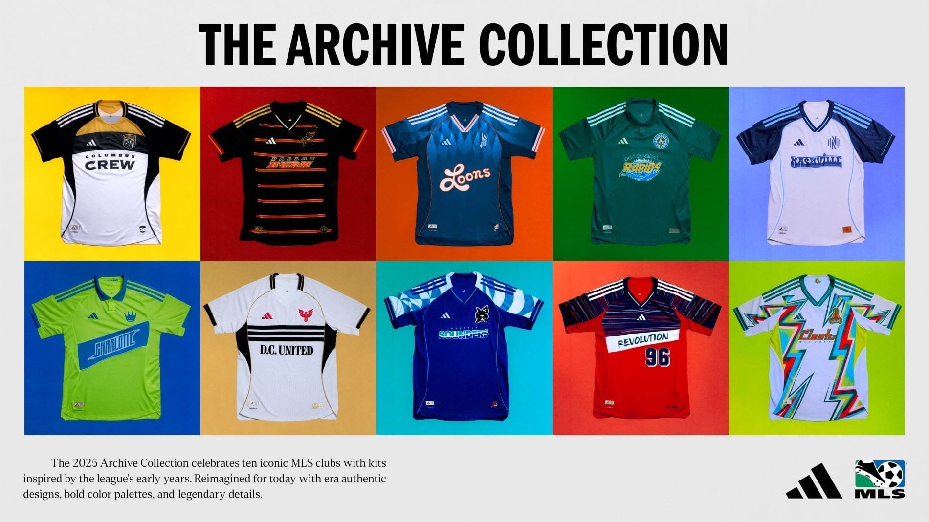
Now, it's MLS dropping another round of its Archive Collection—jerseys that trade on the history of the sport, sometimes MLS history and sometimes...not. These are also being called "Heritage Kits" by the club's themselves which is definitely a better word to apply to a few looks that can't be said to come from anything in an "archive".
This phenomenon creates this odd parallel universe type of effect around the different looks. All of these are meant to be 90s-inspired, but there's a lot going on.
For me, MLS clubs can fall into a few different categories when it comes to history:
- Clubs named for NASL 1.0 teams that typically lean into their connection to the old name and role in the one big American pro soccer effort people remember pre-MLS
- Clubs with no NASL forebear, born into the fashion wasteland of the 1990s
- Clubs with no NASL history that launched in the 21st century and have to make shit up
Because of the league's explosive expansion over the last 15 years, there are lots of clubs with scant history. Hard to conjure up an "archive" look for a team that played its first season in the Bad Bunny Era.
Tití me preguntó...si tengo mucha historia?
Let's take a look at the collection and then breakdown the vibes.
Columbus Crew
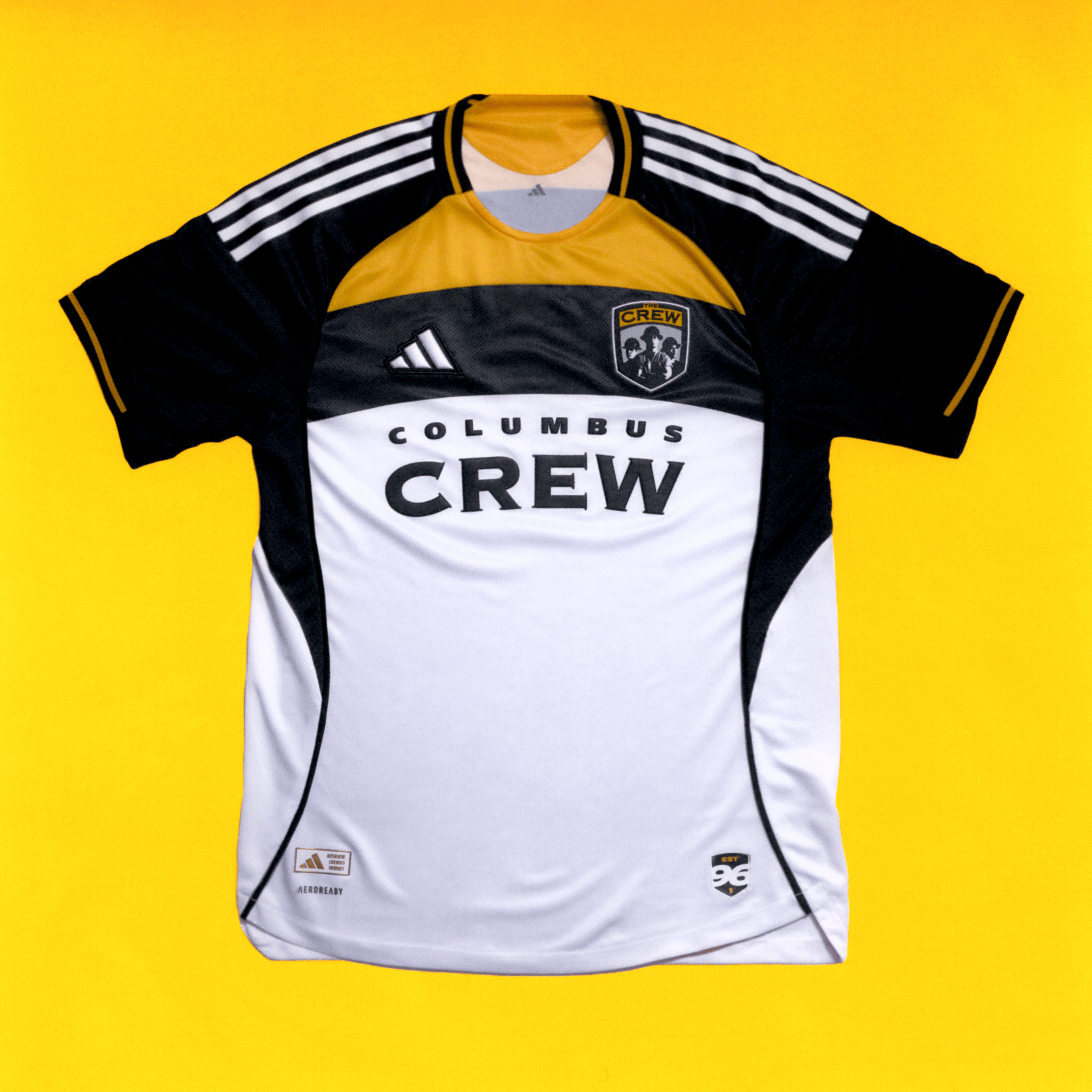
THE original MLS club, which is kinda cool because Columbus can claim the first-ever club in the most successful American soccer league of all-time, while the city down the road (home of hated Hell Is Real Derby rival FC Cincinnati) is famous as the home of the first professional baseball club. Never mind that one happened 127 years before the other. First is first.
Columbus falls, quite obviously, into the "Pure 90s" grouping of clubs. Columbus didn't have a pro soccer history before 1996, so if you're running it back for some nostalgia, all you've got is the days of Brian McBride and Stern John.
Jesus, what's Stern John up to these days?
I'm not reviewing these shirts through a fashion lens (The Athletic did it) so I won't bore you with my opinion of the look—but it seems like this one is generally a hit. I appreciate that it doesn't shy away from what made the original MLS uniforms garishly 90s, while also admitting I'm flummoxed by the interminable cycle of culture bringing anything 90s back into fashion (and yes, I mean the big jeans...what the hell).
The old logo is there! That's fun! Remember when we all made fun of the three guys logo and the club felt the need to dump it when Anthony Precourt bought the team? I really wonder if there would be any warm feelings for that badge if Anthony Precourt hadn't been the one to kill it off, though I recognize the power of nostalgia is strong enough to make anything old enough, cool enough.
I guess 30 years is old enough and now the three guys are cool enough.
FC Dallas
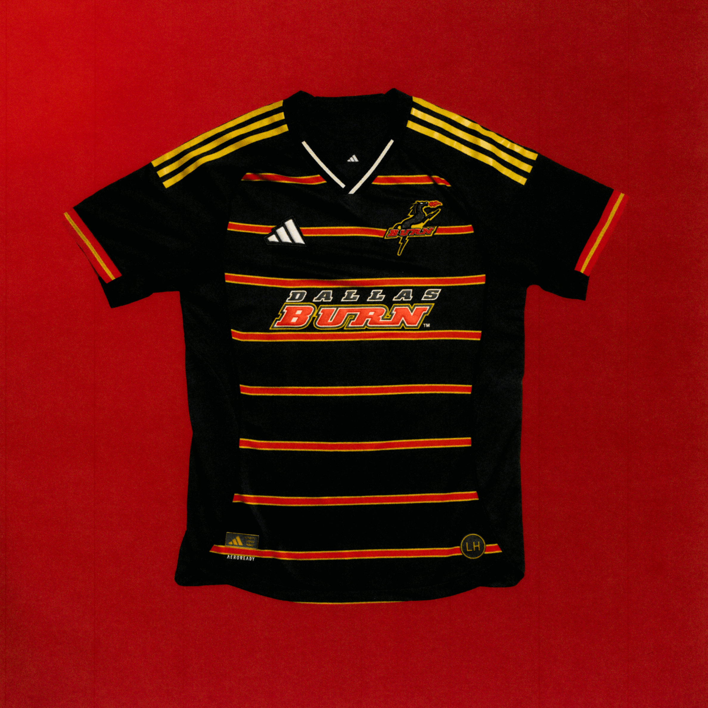
There's a name change involved in this one, which gives it an extra subversive edge. Or maybe it's more of a camp thing—while half the original ten MLS clubs (minus the two dead Florida teams) kept their original names, enough merked their 90s identities to indict everyone involved in their creation. We'll get to some of those shortly.
I can't say I think FC Dallas should have stuck with the fire-breathing horse motif, but it definitely stood out. I think the switch from the horse to the steer was a massive downgrade. People don't eat horses.
There were pre-MLS options for inspiration in Dallas's case, but I suppose if you're team goes back to 1996 and you're dropping a nostalgia look in the 30th season of of the league you helped found, you've got to go with the Burn.
Minnesota United

Here. We. Go. Weird American soccer history on full display.
The Minnesota United entry for the Archive Collection is an amalgamation of Minnesota soccer history that somehow captures something real despite being little more than a fever dream. This is a Frankenstein's monster of a "throwback" kit.
Because United doesn't have much history of its own (MLS history, anyway), this design taps into the NASL era of soccer in the Twin Cities. That font used to emblazon the nickname of the modern club across the chest is a nod to the Minnesota Kicks, the club Taylor Twellman's dad Tim was playing for when Taylor was born in Minneapolis in 1980.
It's a 90s-ish looking shirt that leans on the 70s to give us something wearable in the 2020s. No, that sentence doesn't make sense to me, either.
Colorado Rapids
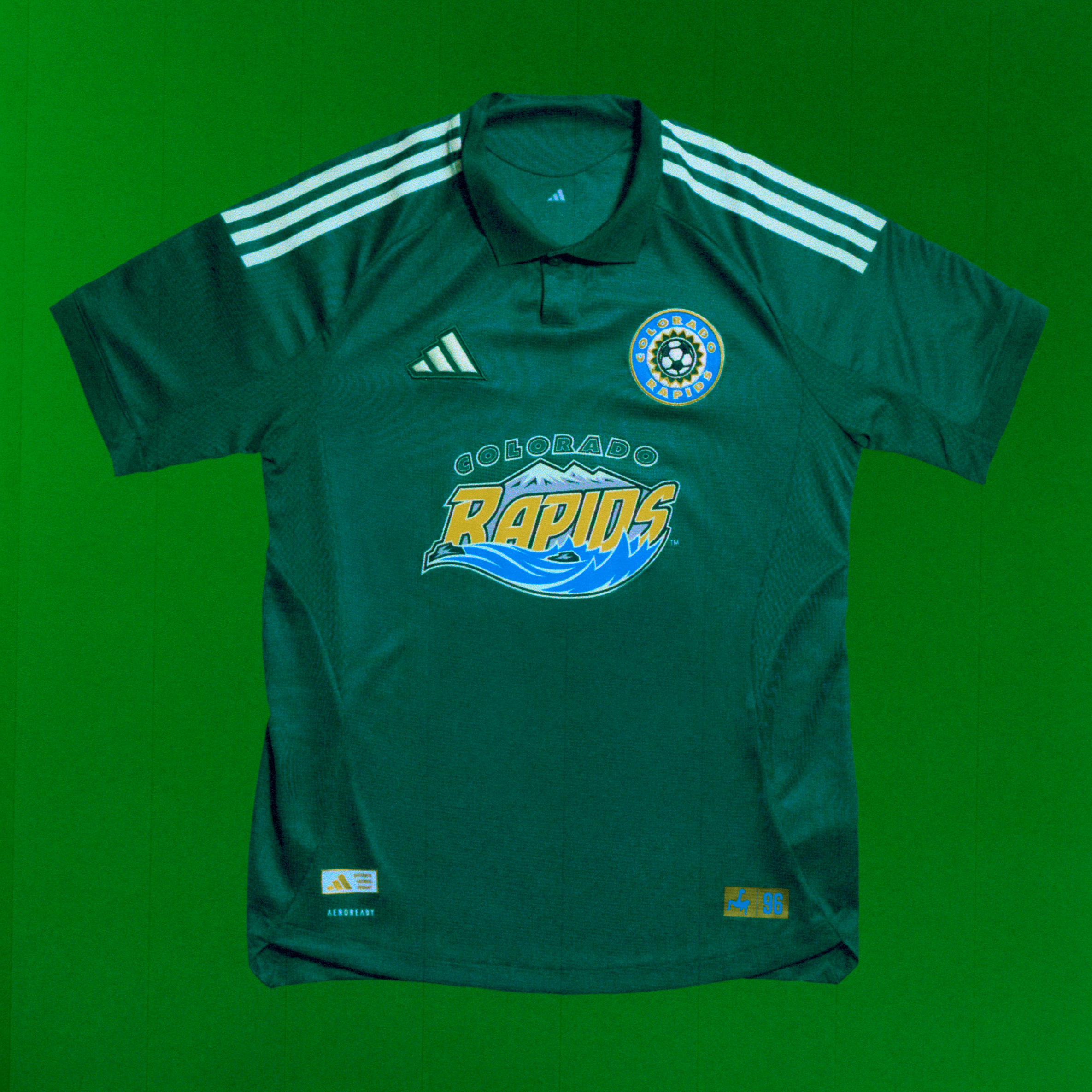
Remember when I said "if it's old enough, it's cool enough"? Uh, I don't think that works here. I'm not sure why the Rapids jersey is a giant miss, exactly, but it definitely is. Maybe it's the combination of two logos, sort of an exponential effect that makes it impossible for the bad things to become (now) good things.
The Rapids are one of the original 10 from '96, forcing a direct reference to the 90s into the mix and it's pretty clear they suffered for it...or a lack of imagination from the people involved in the design doomed them to getting the worst of this batch.
Although...with the most notable soccer antecedent of the Rapids in Denver being the Caribous of Colorado, maybe this is a bullet dodged. This is what the Caribous are most famous for:
But writing this reminded me that the Rapids actually did hearken back to the Caribous in an April Fool's bit in 2014. Oh my God the short shorts. I hope these guys got hazard pay.
I think I'm mostly annoyed by the Rapids effort because despite a rebrand and a soccer-specific stadium, the Rapids have failed to capture much attention in Colorado.
Ownership is largely to blame and I get how hard it is to break through in a football town (full disclosure, I'm a lifelong Broncos fans) with a basketball team that won a title in ::waves at the recent past::. But damn, I'd be willing to bet most of Denver doesn't know the Rapids won an MLS Cup title in 2010. Maybe throwback to that instead...
Never mind. 2010 Gary Smith football was torture.
Nashville SC
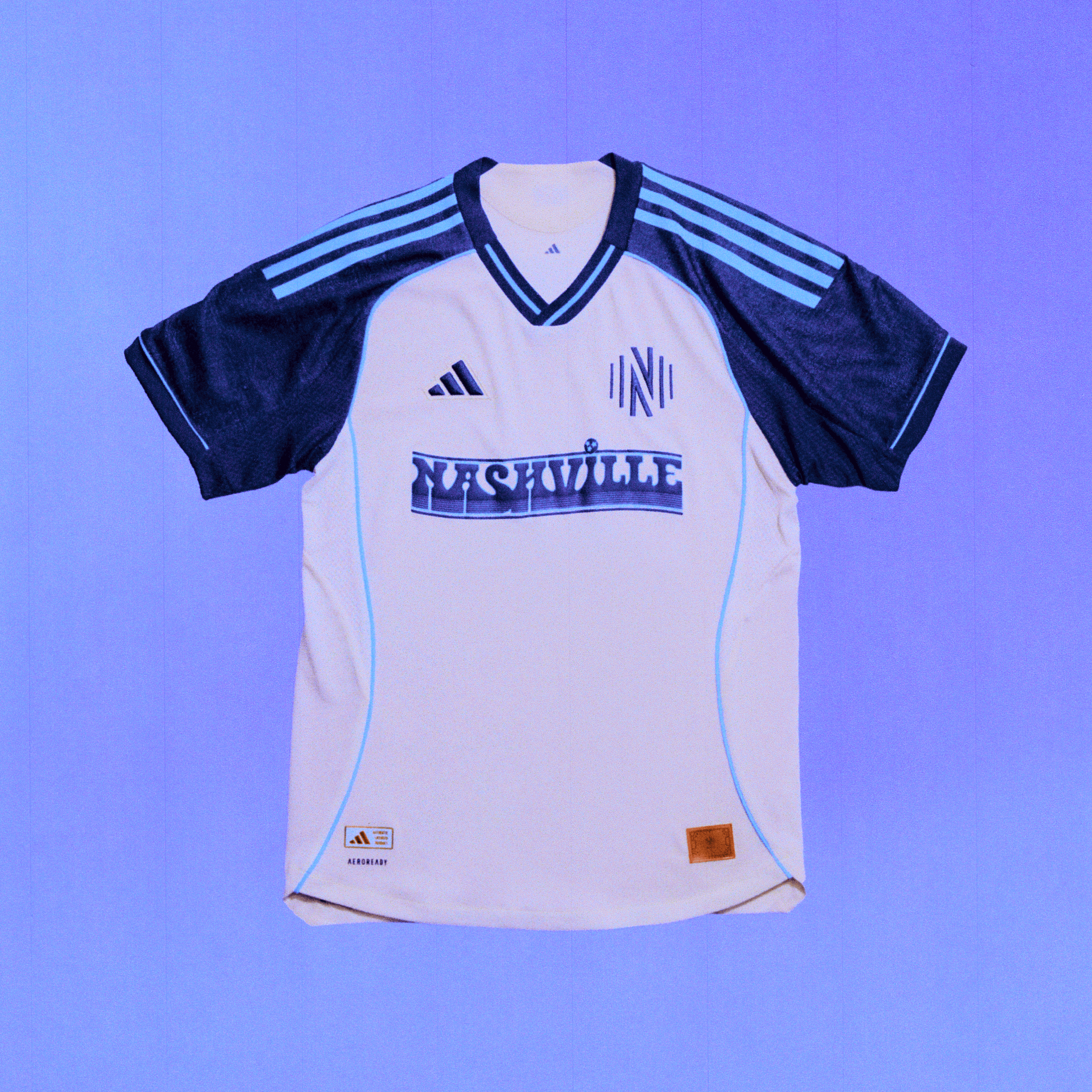
Do I get this?
I do not!
Do I see the history at work here?
No again!
Nashville doesn't have any soccer history prior to the launch of the USL team that predated the MLS team that now boasts Hany Mukhtar. I guess if you're going to lean into history for a town without much soccer history you...make it up? The weird bleeding wordmark thing doesn't exactly imagine what a Nashville club might have been wearing in the 90s. I mean, there's not even a hint of Garth Brooks anywhere to be found.
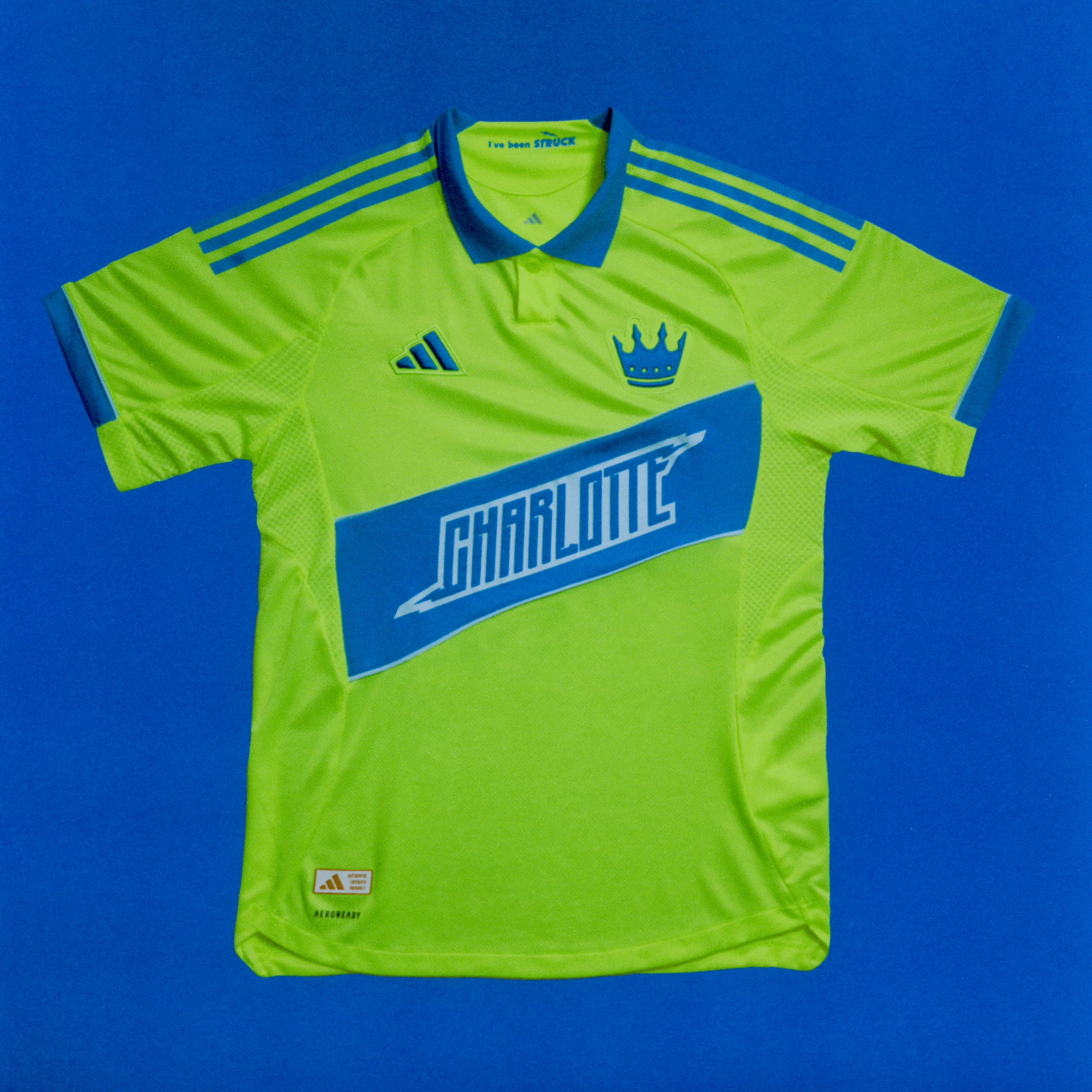
Charlotte FC
Once upon a time I did a radio show on SiriusXMFC that focused on American soccer. It was called "The United States of Soccer" and we did a feature for awhile on dead American soccer teams (called "Ghosts of Soccer Past). I loved that segment. There were lots of teams to talk about.
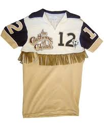
One of the teams we featured was the Carolina Lightinin' (yep, with an apostrophe) tha played in the American Soccer League in the early 80s. The ASL wasn't much at the time, mostly just filling up a few spaces where the NASL wasn't operating. Former Tampa Bay Rowdies star Rodney Marsh was hired to be the Lightnin's first head coach and I got a chance to talk to him about his experience in Charlotte on the show.
I don't remember specifics from the conversation, but I'm positive it was amazing. Rodney brought Bobby Moore over from England to work with the team! The club won an ASL title in 1981 in front of 20,000 people via two set pieces.
This jersey is supposed to invoke the Lightnin'. It's an okay attempt at that and I'm willing to give it a pass because it is calling up a bit of American soccer history that would otherwise stay forgotten. That baby blue fucking rocks. '
DC United
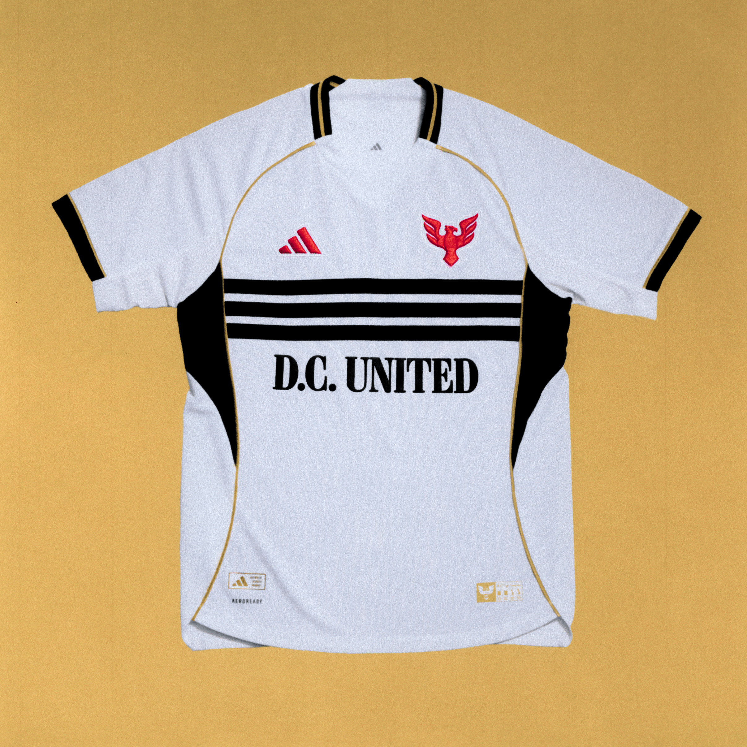
No club has better 90s MLS history than DC United. Oddly, that actually makes it difficult for the club to properly celebrate its history. Bruce Arena's championship-winning teams cast such a dark shadow over the most of the 21st century that instead of being a point of pride it becomes an indictment.
But this exactly the history that United should be trading on and fans need to celebrate. If we can get over the unncessary embarassment a lot of American soccer fans seems to feel about things like the early days of MLS (football lines! 30-yard shootouts! empty NFL stadiums!)—which we absolutely should do—DC United's three-stripes chest plate can be lifted up as one of the iconic visuals from the history of Major League soccer.
I'd prefer a white-on-black look to this black-on-white shirt, but I'm not bad about it. DC's Archive Collection jersey might as well be handing me a pack of Gushers and a bottle of Orbitz. Yum, jelly balls.
New England Revolution
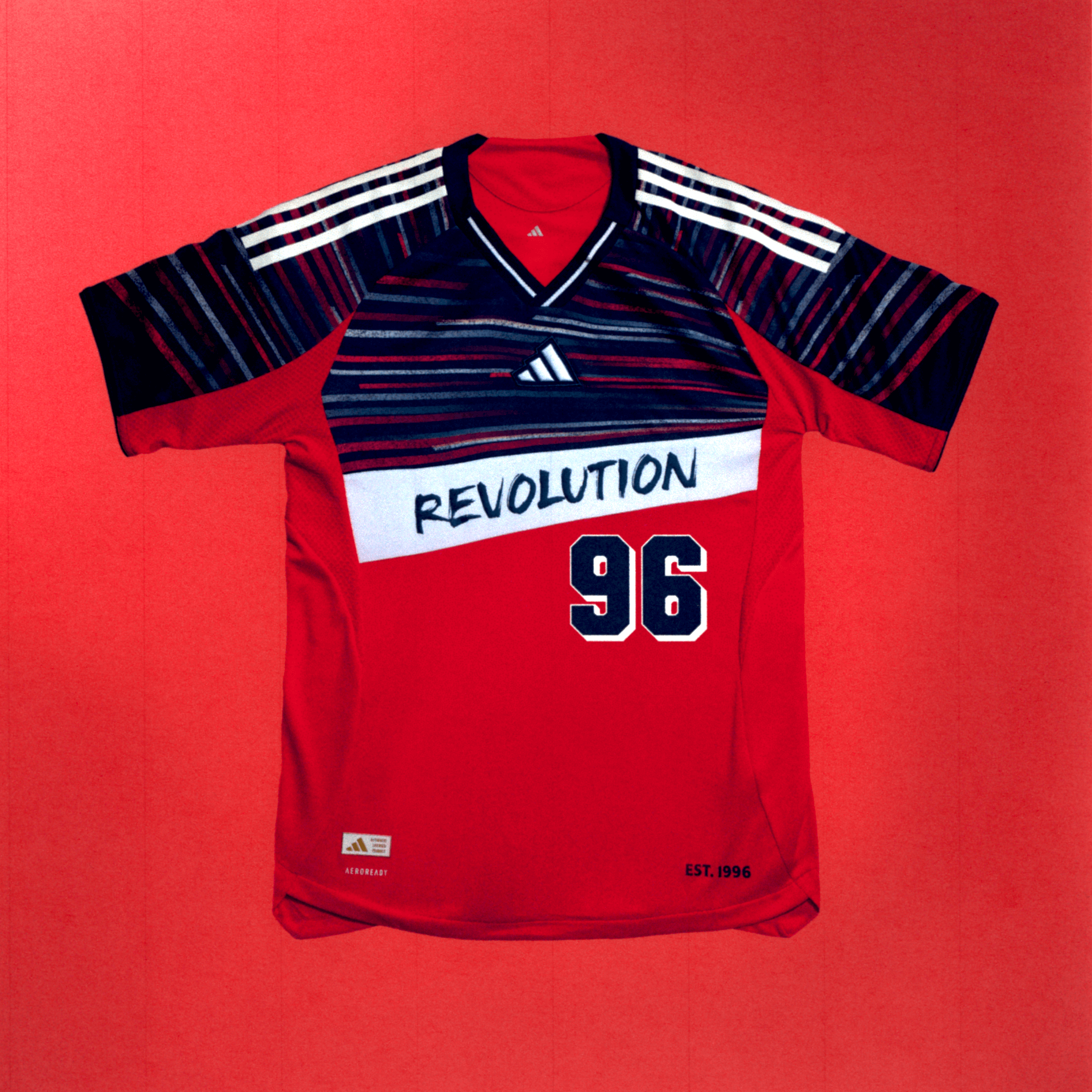
No one held onto their super duper 90s vibe as long as the Revs. In fact, their rebrand happened so recently that it almost makes sense this Archive Collection effort doesn't include it. Instead of throwing it back to the 90s (which the wordmark "Revolution" does, in good measure), the old badge might just annoy the people who didn't want a rebrand in the first place.
It's not that I hate the new Revs logo, it's just that it's emblematic of an irrepressable need on the part of people in charge of American soccer teams to "update" and "improve" things that could, if given enough time, become normalized. It's worth wondering if the Revs would have bothered with a new logo if the team was keeping up with the top clubs in MLS. If you don't have to worry about jucing the excitement meter, you probably don't get the urge to mess with the brand.
The crayon flag really did suck, though.
Since we're here and talking about the Revolution's rebrand, I thought this quote from Cathal Conlon, the Revolution’s Vice President of Marketing and Community Engagement from a Boston.com piece at the time of the rebrand was interesting. He's talking about how upset fans were when the idea of changing the club's name came up.
“That was certainly an eye-opener for me,” Conlon admitted. “I would’ve been of the opinion that the names from 1996 were from MLS 1.0 and that should be updated too, and I could not have been more wrong. It’s really important to people.”
Damn straight. What I often don't love about rebrands that involve changing club names in particular is that it means creating a break with the past limits full appreciate of an organizations full history. Rebrands might be about "modernizing", but sometimes they just send the message that a club is ashamed of its past.
San Jose Earthquakes
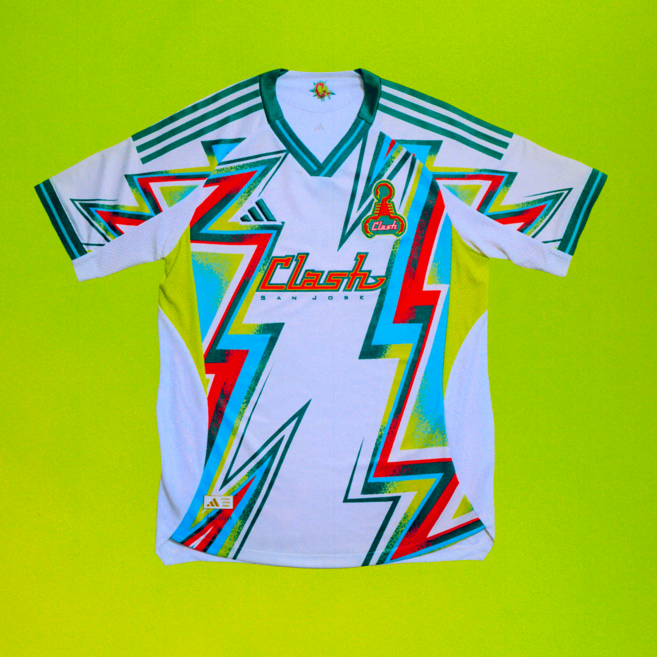
We can fight about it if you want, but this is the best of the batch BY FAR. Very 90s, old school clash logo with the scorpion—it all screams MLS 1.0 and I truly wish this wasn't just a one-off moment for the San Jose MLS team.
The Earthquakes dropping the Clash identity back in 1999 to turn back the clock to the old NASL Earthquakes and then turing to its weirdo 90s name for throwback material is a pretzel of American soccer history predelcetions and an example of how things that were terrible become rad through the simple passage of time.
The Clash thing wasn't great to start with and it made sense to switch to the Earthquakes to grab some of the cache that still lingered from the NASL days. I'm not going to pretend otherwise. It's just amusing that it worked out so an original club with a name that goes back to the 1970s is putting out a shirt that doesn't celebrate the era of George Best, but that of Eric Wynalda.
Seattle Sounders
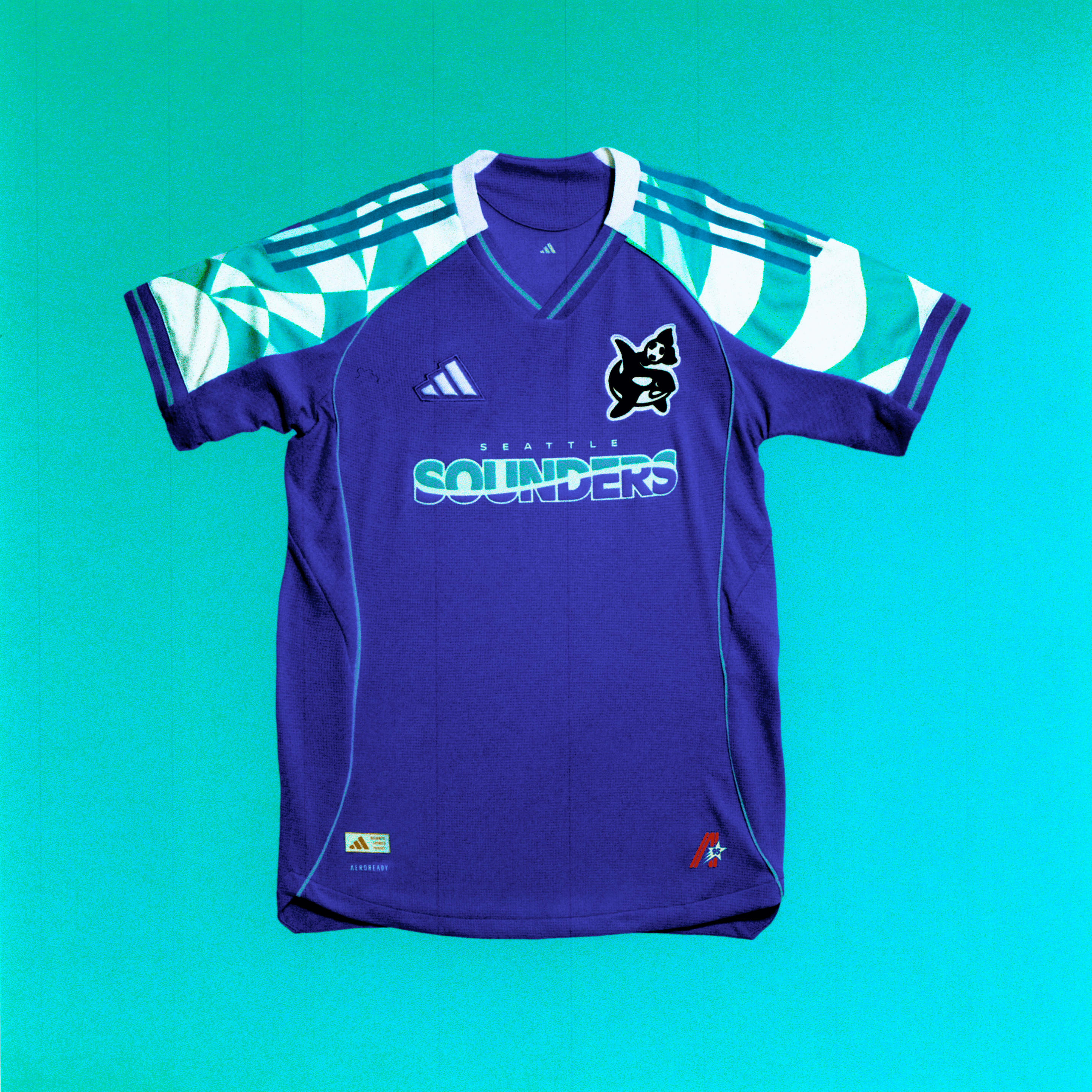
The Clash have the best look. The Sounders have the best nod to history.
As a club with an MLS history that only goes back to 2009, the Sounders didn't have an history in the league from the 90s to use as inspiration. There's the NASL history, of course, and maybe the Sounders could have pulled off a Minnesota-like trick with a shirt that looked 90s while referencing the 70s. But Seattle is already very connected to its NASL history. Going back to that well wouldn't feel special, exactly.
What the Sounders have that a lot of the expansion era clubs don't is a noteworthy history under the same name from a lower leagues existence. The 90s Sounders played in the old A-League, a competition that also birthed the 2.0 version of the Portland Timbers. Turning to the Sounders look of the 90s is definitely the obvious thing to do, but I still think its notable.
The Sounders might be better at making no apologies for their less-glamorous past than most. That has everything to do with Adrian Hanauer's involvement from the "orca heading a soccer ball surrounded by a starburst" era to the present day.
History. We gots some. I'm glad we're celebrating it, even if it's unclear whether the Archive Collection is an earnest attempt to recall history we should never hide from or just a cash grab capilitizing on the fact that 90s style is cool again.
Just a few links and other stuff to share before I wrap this up.
- If you've been following my coverage of the new Cosmos, there's an interview up on the Morning Kickaround YouTube channel (please subscribe!) with North Jersey Pro Soccer/Cosmos CEO Erik Stover. Erik answers some questions about why they decided to bring back the Cosmos name in Paterson, New Jersey.
Morning Kickaround Interview With Erik Stover
- Short Corner Media and CLUBELEVEN just launched a very cool project where they're trying to collect media and memories of the 1994 World Cup from American soccer fans. We're going to get Greg Lalas of Short Corner Media on Morning Kickaround on Monday to get more details, but in the meantime here's a form you can fill out if you have something to contribute.
- There's a new episode of The Best Soccer Show out, available wherever you get podcasts. We spent most of the show debating the best XI in USMNT history. It was vintage Best Soccer Show. Have a listen or watch on YouTube.
- Follow me on Bluesky